SokoTech / 2019
Mesh
Visual design for MESH project by SokoTech
MESH (Maker Education Social Hack) is an open-source educational program developed in Barcelona by SokoTech, utilizing the maker culture and collaborative learning to empower educators and young people in vulnerable communities. The initiative promotes creativity, inclusion, and hands-on education through open-source tools and community-driven projects.
Overview
My role in the project
I focused on defining a distinct and recognizable visual system capable of representing the values of lifelong learning, STEAM education, and the open, experimental nature of maker culture. It needed to be flexible and scalable, adaptable across a range of formats and environments, from digital platforms to printed educational materials, while maintaining coherence and consistency.
The Challenge
Build an identity for the future generation of educators
The MESH project was conceived as a new initiative with no prior references in the Barcelona context. There was no existing visual language or comparable framework to build upon; the visual identity had to be developed entirely from scratch.
- Create a recognizable identity.
- Build a scalable, adaptable visual language system.
- Translate educational values into visual communication.
Understanding
Exploring similar initiatives
As a first step in the development process, I conducted a research on educational programs and initiatives with similar objectives. The goal was to gather insights and inspiration from existing identities, communication systems, and visual languages. This research helped to define the core values and principles that would guide the development of the visual identity.
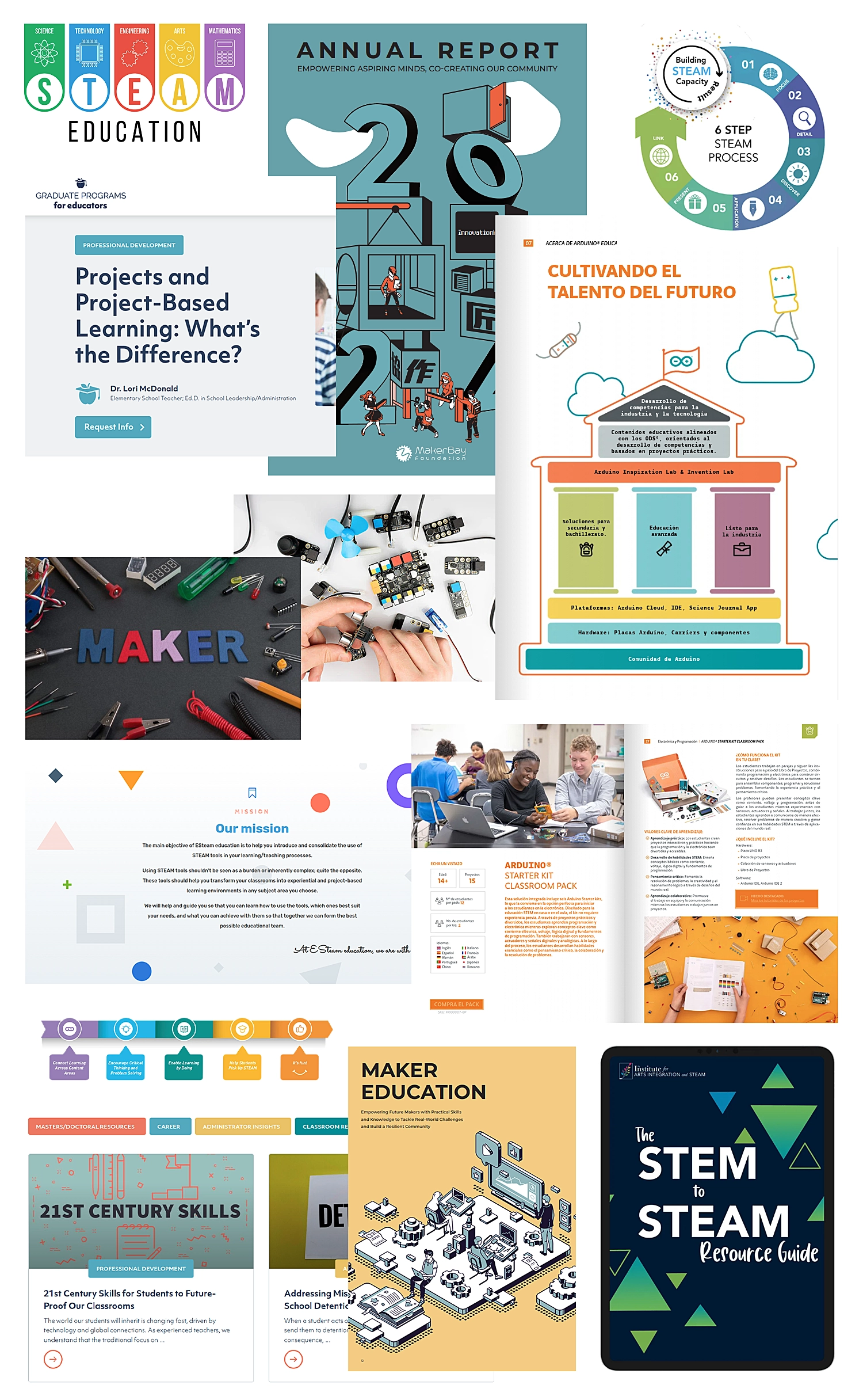
I collected visual samples from a variety of projects, including:
- Educational programs focused on social inclusion and community engagement.
- STEAM-focused initiatives and maker education programs.
- Open-source and lifelong learning platforms.
This research helped identify patterns, design strategies, and opportunities for differentiation by analyzing typography, color palettes, layouts, iconography, and branding approaches.
Development
Defining the Typographic System
The objective of the first step was to establish a system that balanced expression and functionality, reflecting the technological nature of STEAM education and the open-source community, prioritizing readability and accessibility.
- Must meet accessibility requirements
- Open-Source philosophy
- Digital/Physical compatibility
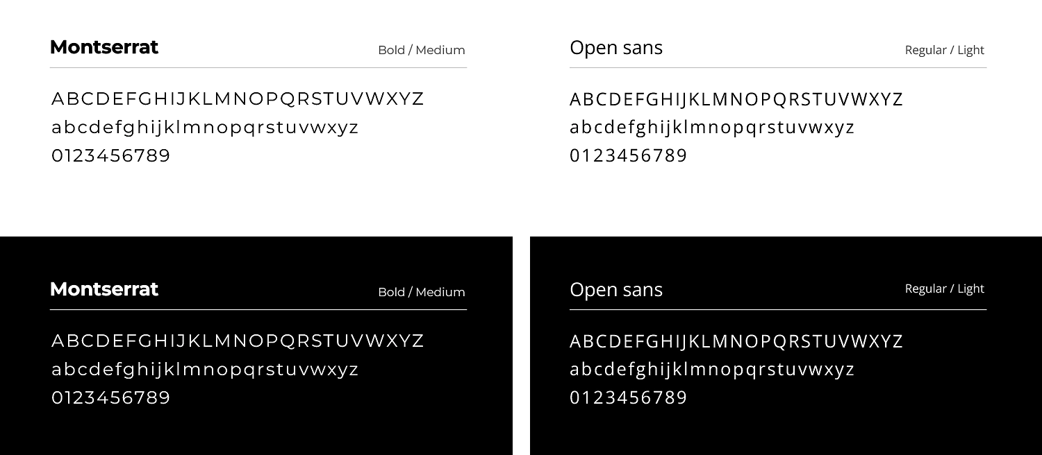
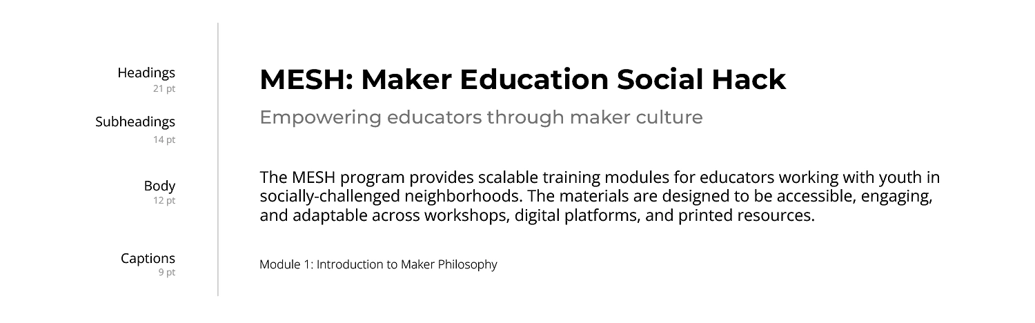
I selected a combination of Montserrat, a geometric sans-serif typeface used for headings to establish structure, hierarchy, and visual presence, and Open Sans, a humanist sans-serif chosen for body text due to its high legibility and comfort in extended reading, as it was specifically designed for digital interfaces and web readability.
The MESH colors
I selected a color palette that would support the identity and reflect the program’s core values: lifelong learning, STEAM education, inclusivity, and openness. It was designed to be suitable for both digital and print applications.
Why I selected this colors:
- Creativity: vibrant accents to engage educators and youth.
- Clarity: neutral tones to ensure readability and professional applications.
- Accessibility: balanced contrasts to be visually accessible for all audiences.
Core System (Foundational)
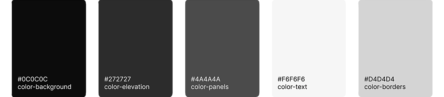
For the core foundational system, I defined colors that ensure consistency across all applications, covering backgrounds, elevations, panels, text, and borders.
STEAM System (Brand Semantic)
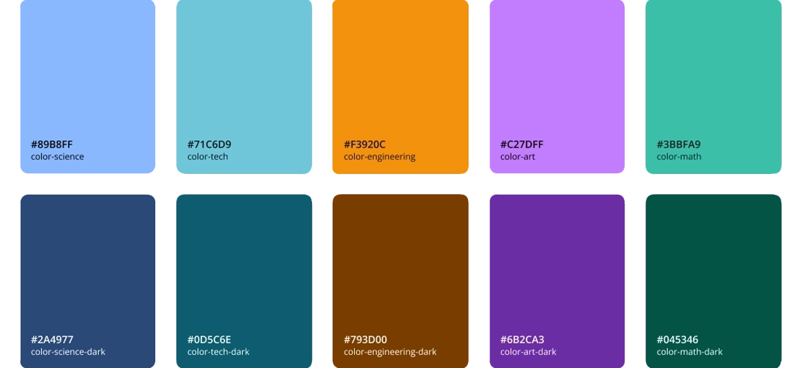
I defined a semantic color system, where each discipline is represented by a distinct color reflecting its values and purpose:
- Blue: Science
- Cyan: Technology
- Orange: Engineering
- Purple: Arts
- Green: Mathematics
Notifications (System Semantic)
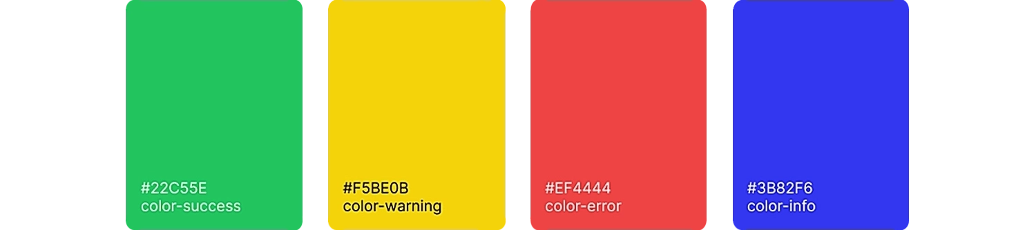
For notification colors, I decided to follow the traditional status and feedback palette commonly used across most systems to ensure consistency across applications:
- Green: Success
- Yellow: Warning
- Red: Alert
- Blue: Notification
Accessibility
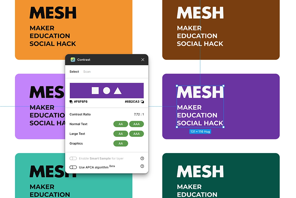
For this important requirement I focused primarly on readability through clear contrast and legible typography. I performed simple contrast comparisons validate these choices: dark text on light backgrounds and light text on dark backgrounds are used to ensure optimal clarity on digital and print materials.
Logo Design & Visual Identity
The goal was to develop a flexible, recognizable mark that could be applied consistently across digital and print materials.
- The logo needed to function at different sizes, from small web icons to large print posters.
- Variations for digital applications, print, and workshop materials.
- Alignment with the Typography & Color System.
Logotype Concept
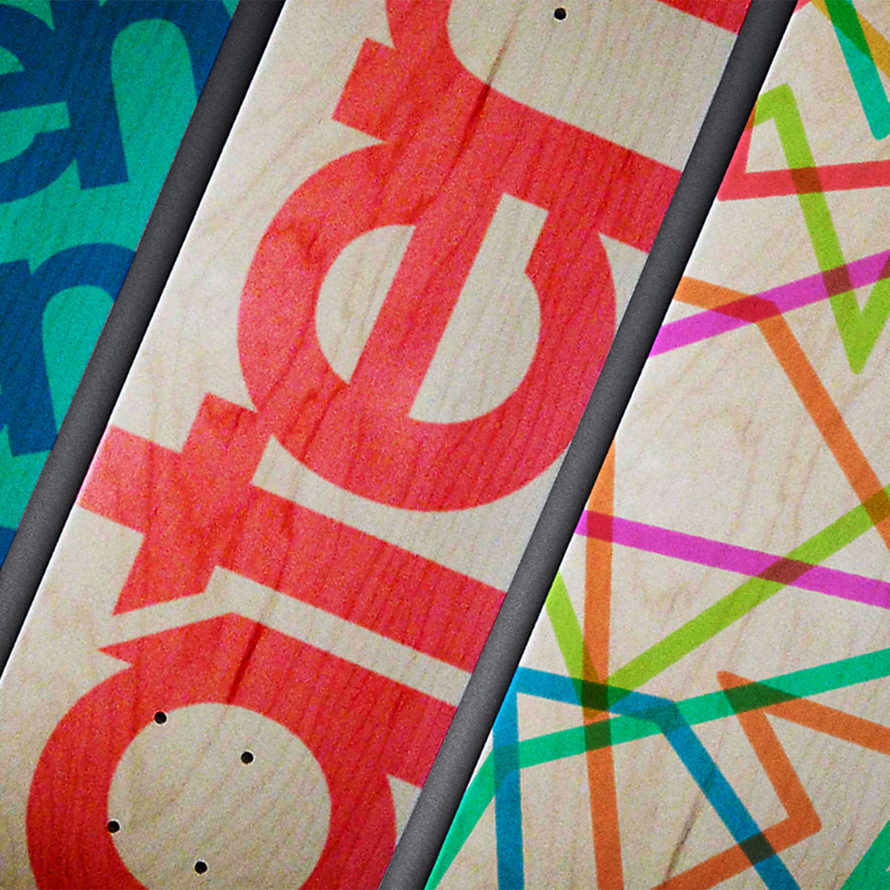
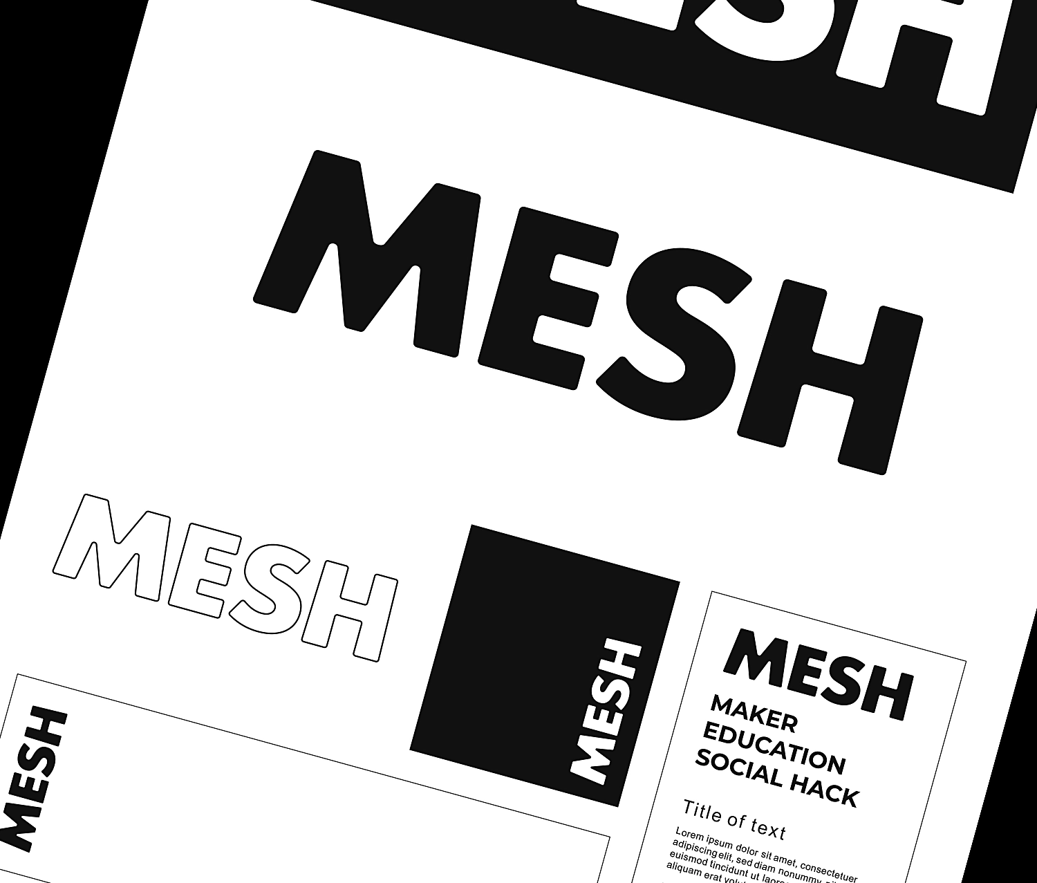
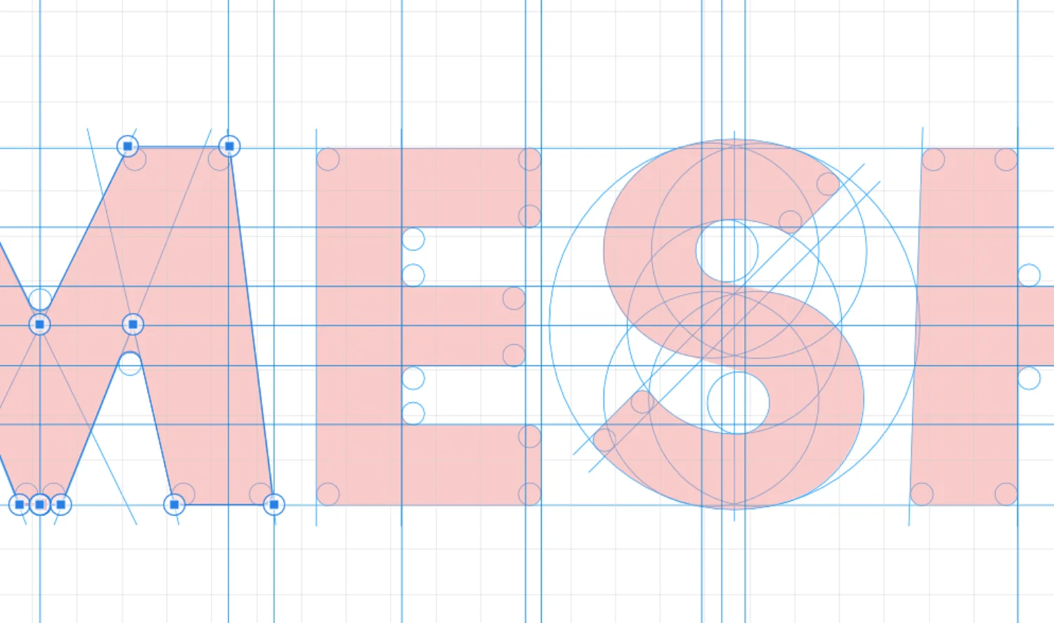
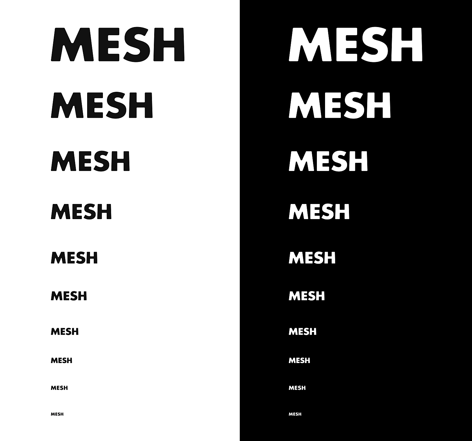
The design of logo revolves around a bold typographic approach that emphasizes clarity, strength and implementation flexibility. I used geometric letterforms looking for a sense of structure and precision while at the same time subtle irregularities and softened edges comunicates a human, crafted quality that reflects the experimental and hands-on nature of maker movement.
Flexibility & Scalability
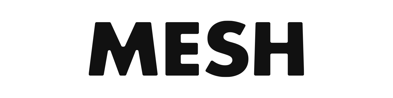
I designed the logo with the objective of having consistent recognition across digital and printed applications. Its geometric forms allow it to function equally well at small sizes, such as digital icons or social media avatars, and at large scales, like workshop signage or printed banners.
Logo Variations
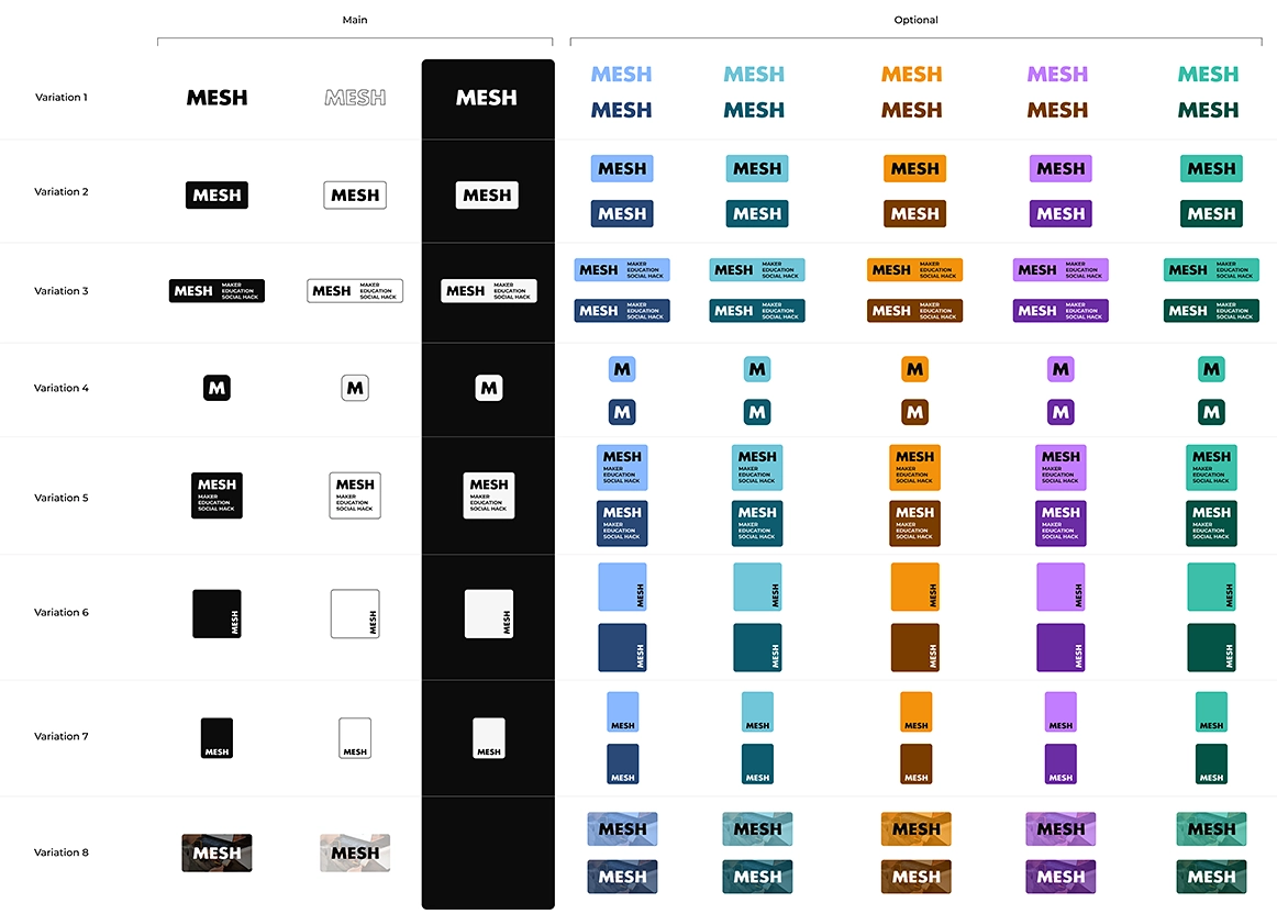
I created a flexible system of variations to ensure consistent use across different contexts. In addition to the main versions, optional variants allow for adaptability across sizes, backgrounds, and formats.
Consistency Across Identity
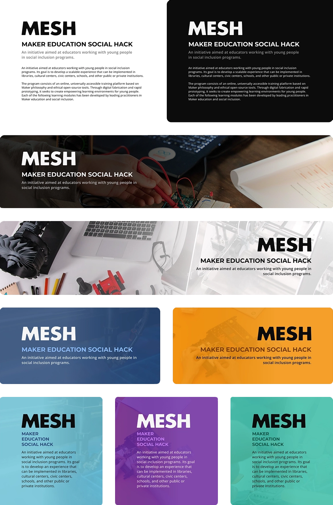
The logo works harmoniously with the typography (Montserrat + Open Sans) and the color palette, creating a cohesive identity system. Its adaptable form ensures clear visibility.
Solution
The MESH Brand Identity
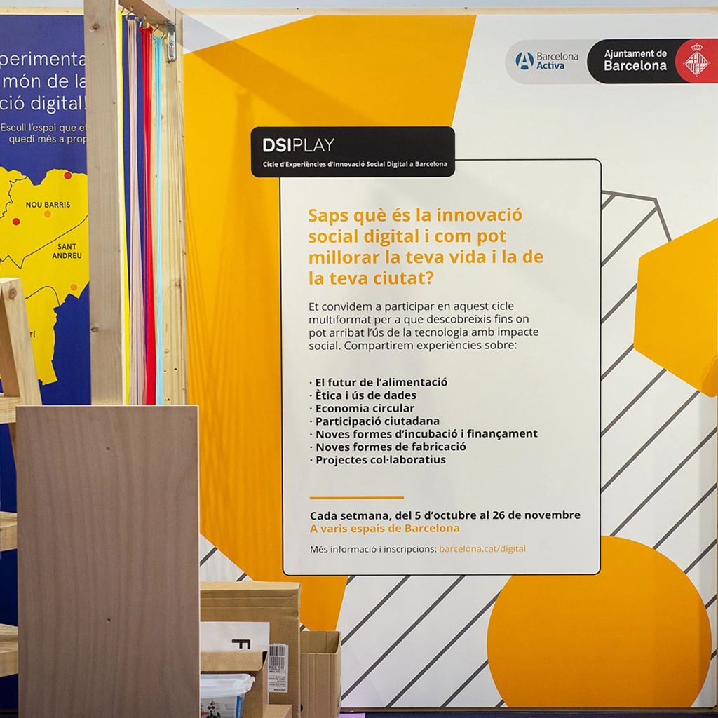
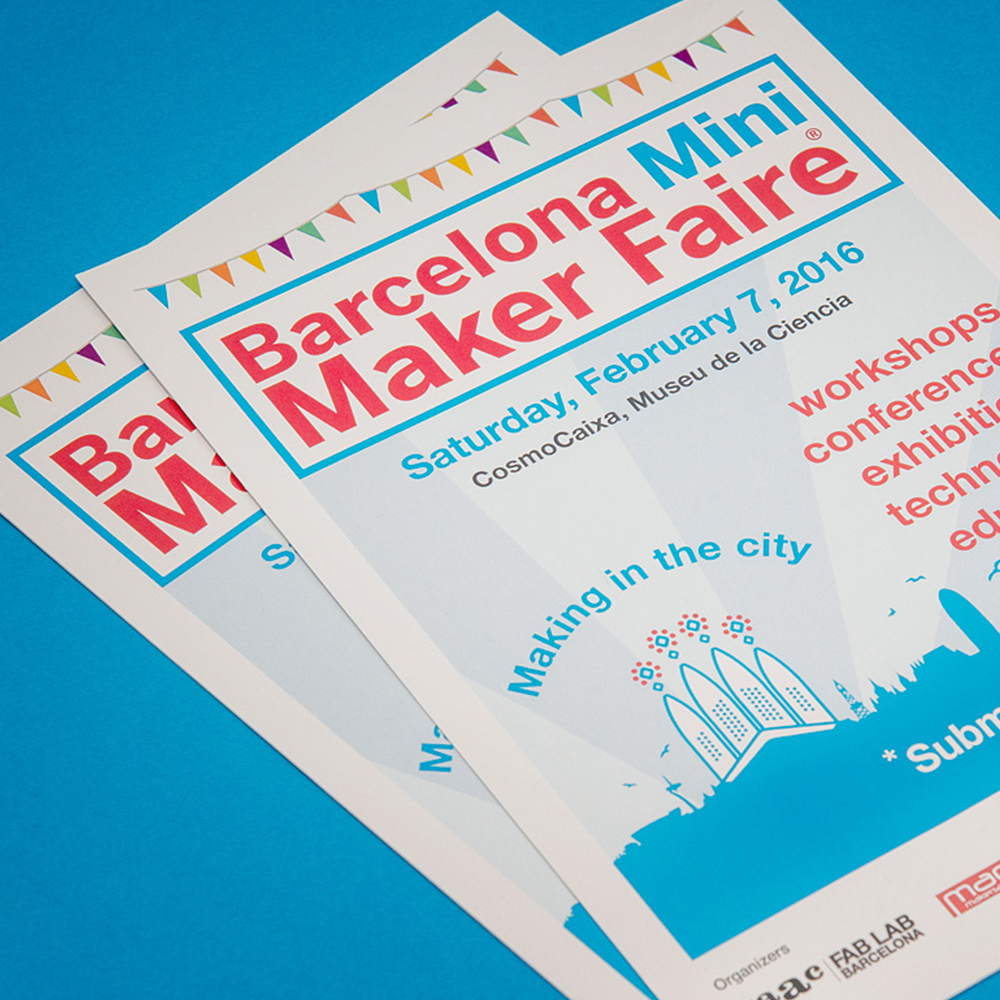
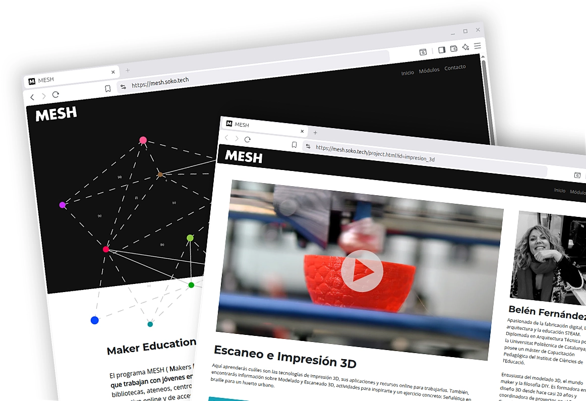
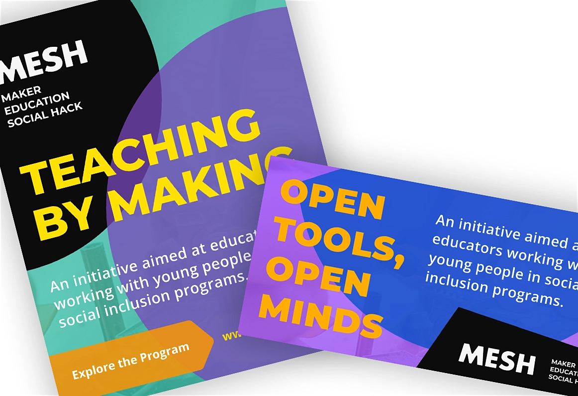
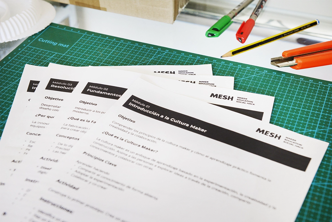
Once the core visual identity was defined, my focus shifted into applying it across a variety of real-world applications. Each carefully designed to maintain visual consistency when adapting the elements to the specific format and audience needs. The system ensured that MESH materials remained readable, engaging, and recognizable when used in digital or physical environments.
Posters & Event Banners, Digital Assets & Web Templates
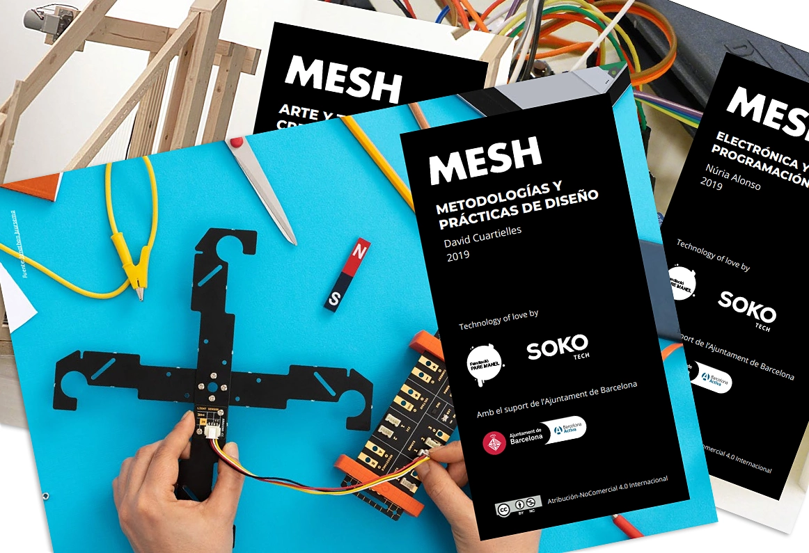
Digital Templates
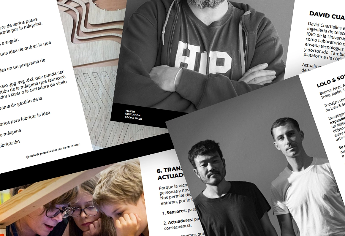
Workshop Materials
The Outcome
The identity I created for MESH played a critical role in strengthening the program’s recognition, engagement, and scalability, providing a consistent, accessible, and flexible design kit.
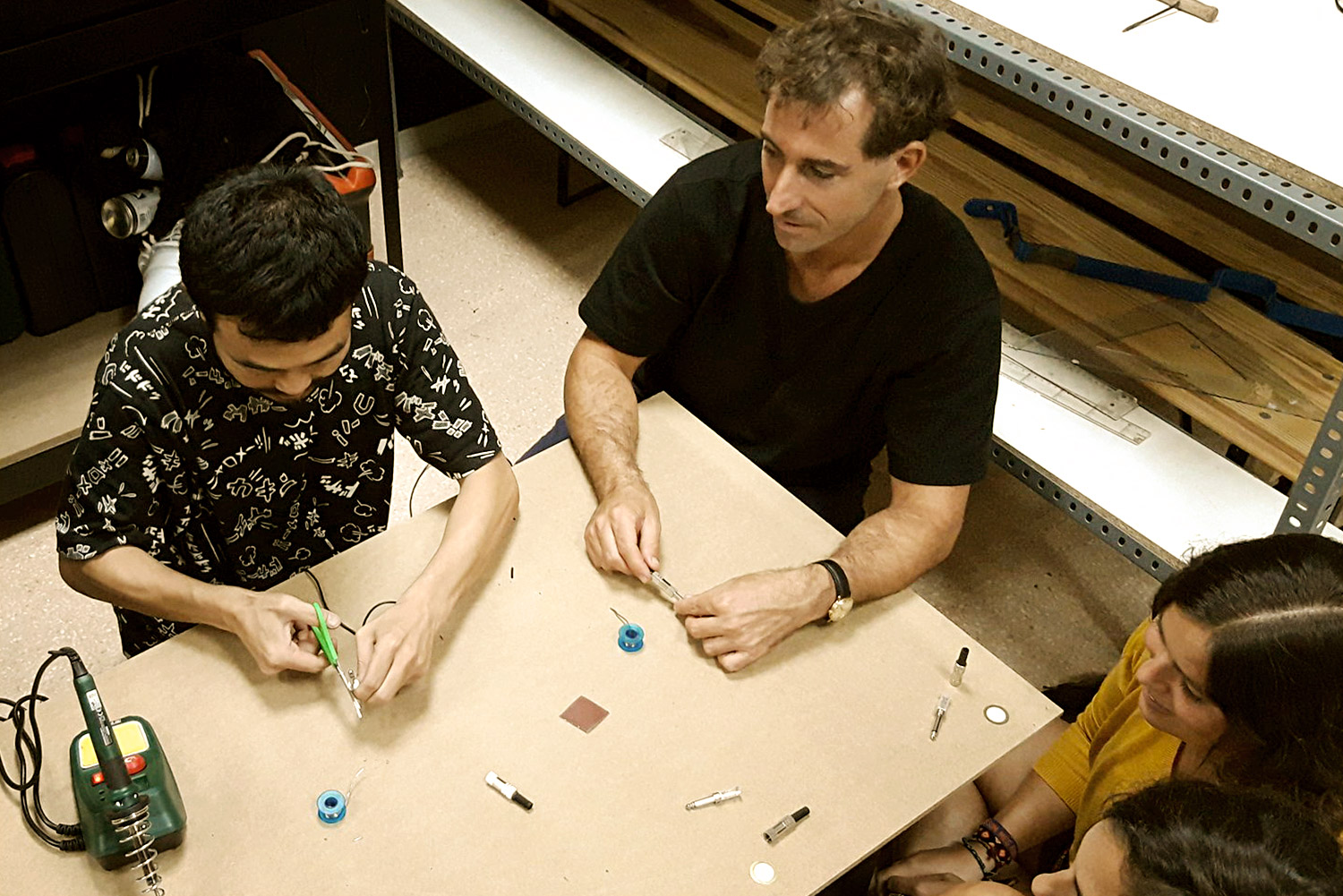
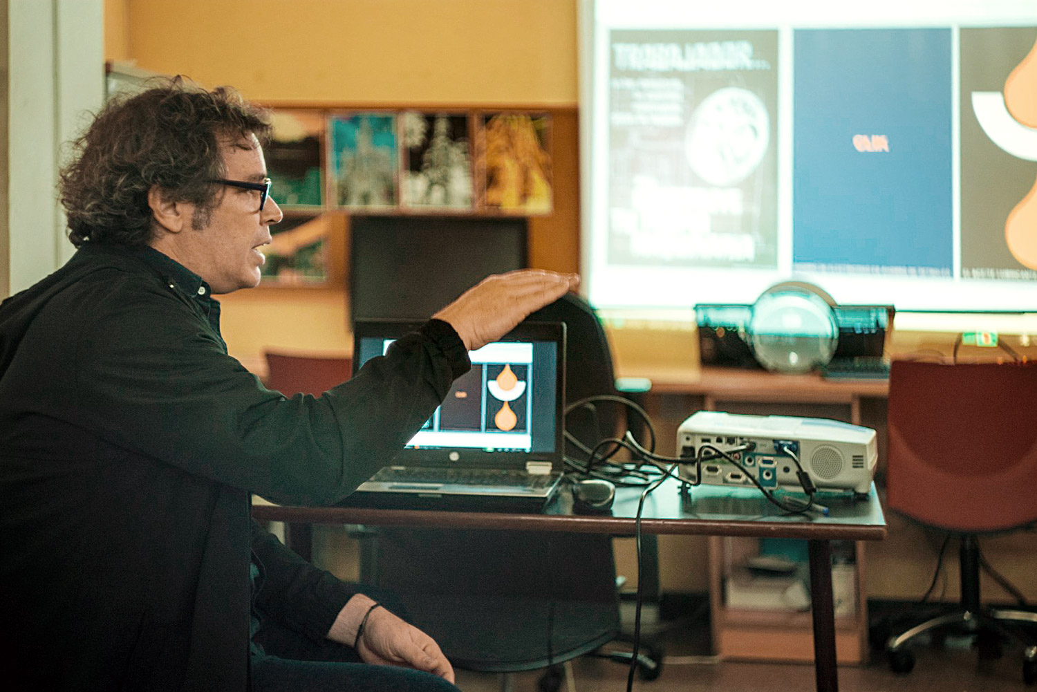
The identity I created reinforced the maker-culture ethos for the Mesh project making the materials approachable for diverse audiences and encouraging them to participate in the program.