Overview
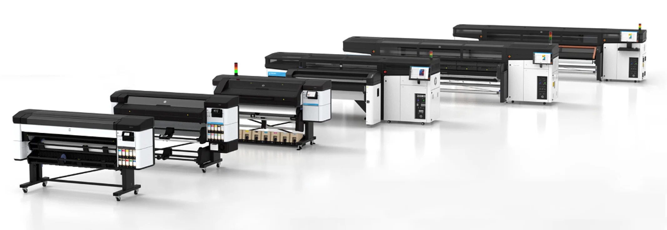
The specialized large format printing experience
In high-demand production environments, where efficiency and precision are crucial, the user interaction with printing systems must be straightforward to avoid delivery issues.
As part of the continuous value delivery for the users, we’ve got feedback pointing out that we needed to revisit how operators engage with the printer UI to ensure that every interaction is intuitive, responsive, and optimized for speed and efficiency.
My role
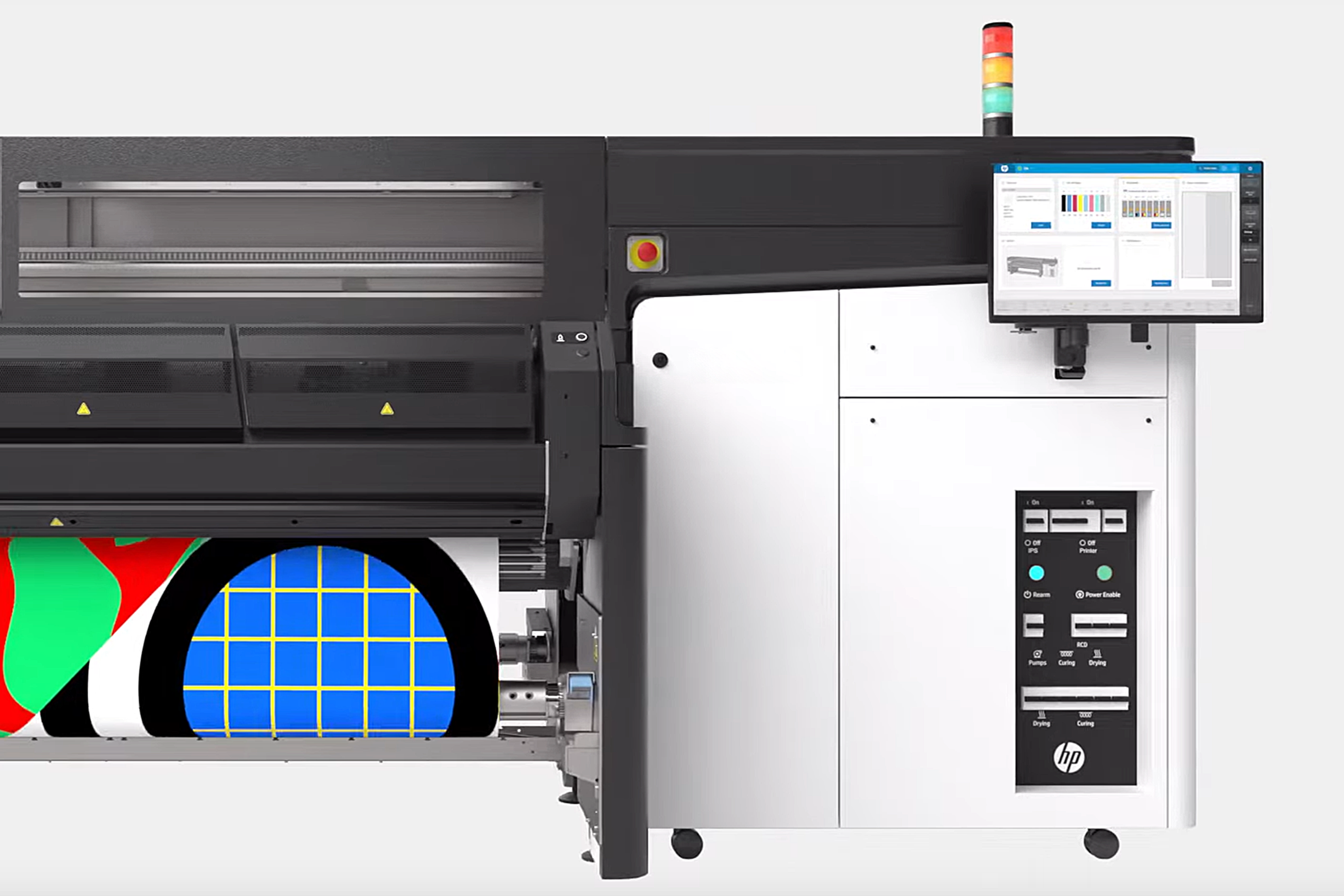
I was part of this project by leading the redesign of the operation experience within the control panel of one of the most technologically advanced, industry leaders for large-format industrial printing solutions.
The objectives for this project:
- Understand how the user needs have evolved
- Reduce operational pain points.
- Align the usability to the unified platform user interface experience.
The challenge
Redesign the UI printing experience for the professional users
Designing for specialized users in a production environment requires special attention to advanced features to provide them with the right experience to help them deliver without compromising efficiency. The challenge was to reimagine the printer interface to fix existing problems and align the it with the unified platform experience, ensuring consistency in both look, feel, and ease of use.
To achieve our goals, I’ve looked into the needs of our users, understand the current status of the UI, take a deep dive into the user interaction to define a solution that improves the user satisfaction and meet the strategic design goals for the business.
Discovery
How the current design is performing in the field?
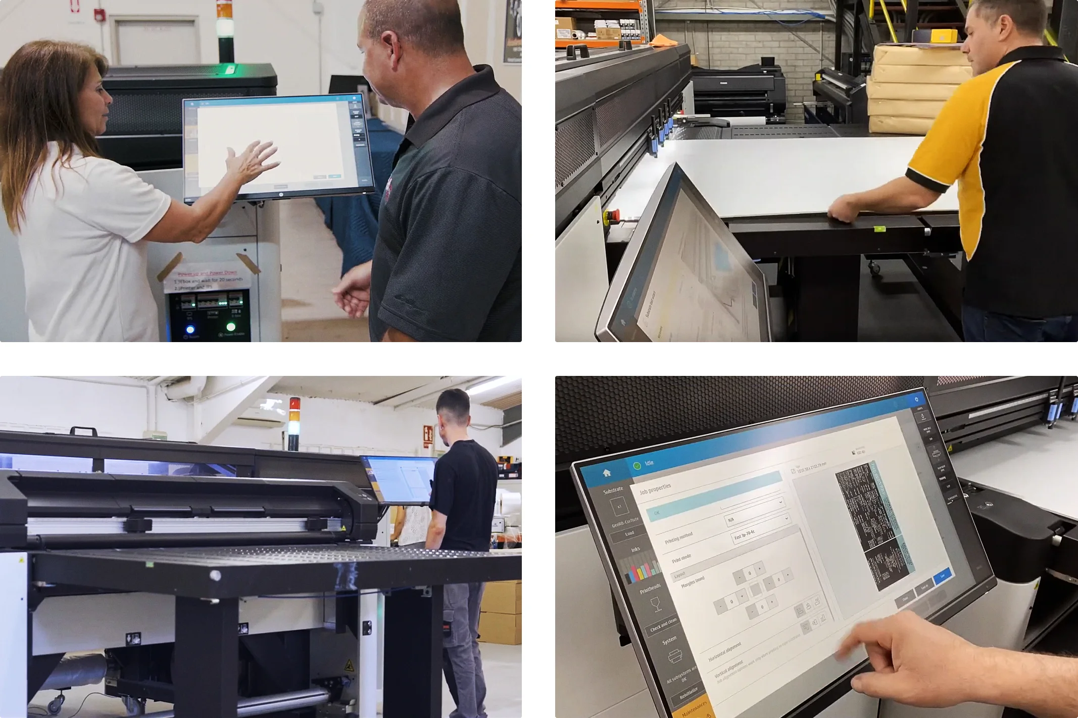
The first critical task was to gain deep insights into how the current printer interface performs in real-world production environments. Understanding the performance in the actual workspaces, is important to fully understand their challenges, from navigating complex menus to handling inefficient workflows and inconsistent UI elements.
All this allowed me to understand their pain points, frustrations, and needs, not just from a technical standpoint but also from a human-centered perspective.
Who are our users?
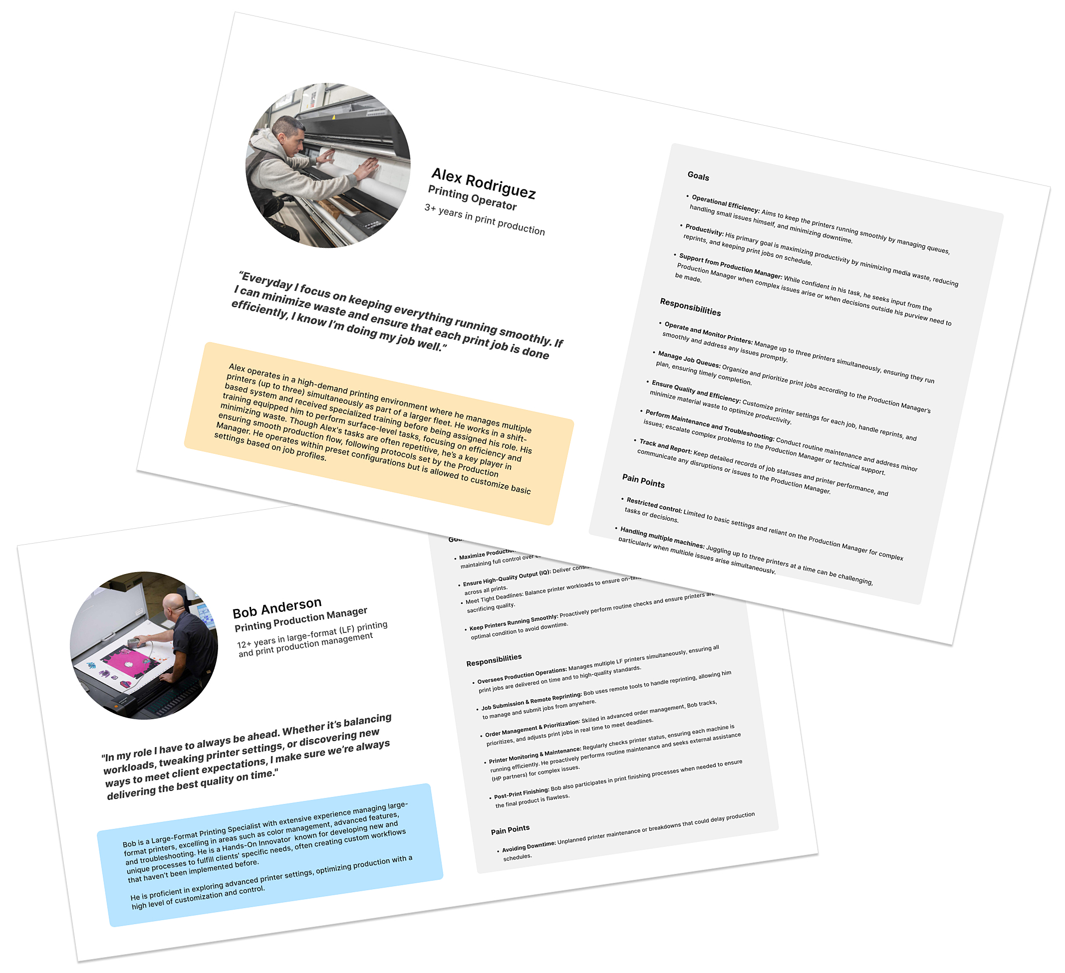
Each of our users plays a distinct role within the production environment, each with unique needs and challenges. The Print Manager oversees the entire printing workflow, focusing on high-level tasks such as job scheduling, system maintenance, and performance monitoring. The Print Operator works hands-on with the machines, interacting directly with the control panel to perform tasks like job setup, troubleshooting, and calibrations.
A closer look at daily operations in the print production setting
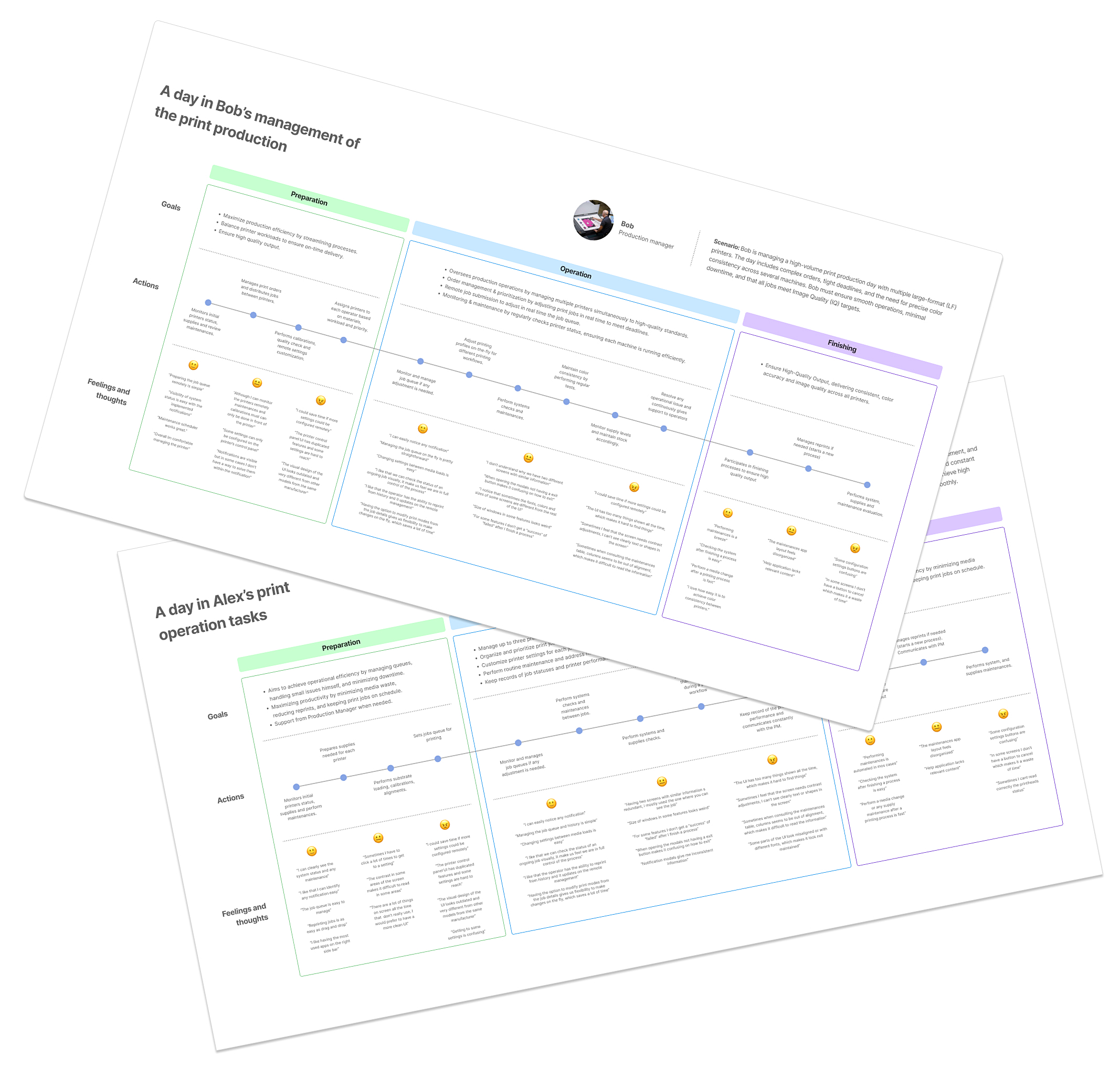
To better visualize each user’s daily experiences, I created journey maps detailing a typical day in their professional context.
These journey maps help visualize the challenges each user faces throughout their day, identifying critical touch points where better user interface design and functionality could significantly improve their experience.
Identifying challenges and opportunities
I synthesized the key insights to identify the challenges they encounter in their daily workflows. These challenges were translated into a concept map to visualize the areas of opportunity for improving the overall user experience.
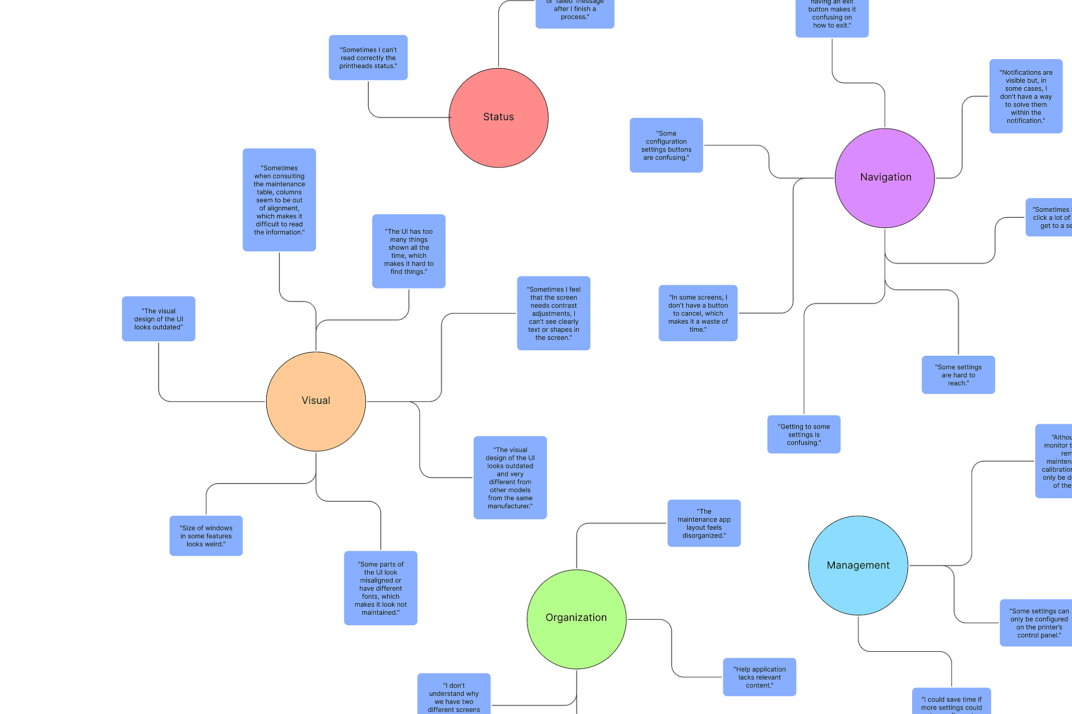
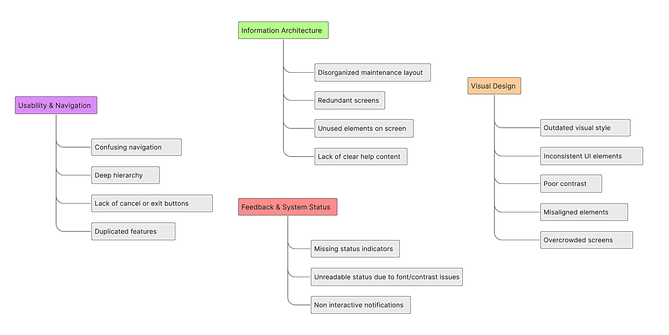
The concept map highlights recurring pain points that affect the usability. By breaking down these issues into categories we gained a clearer understanding of where the current interface falls short, prioritizing the areas for improvement.
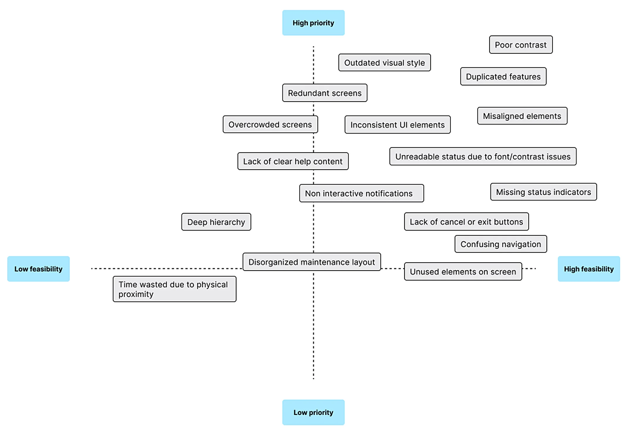
With a clear view of the opportunities at hand, I prioritized them based on key factors like the resources required to implement and the business strategy. High-impact improvements that address critical user pain points—such as navigation, inconsistent UI, and redundancy—were prioritized due to their potential to significantly enhance efficiency and user experience.
Definition
A design strategy for consistency, simplicity, and efficiency
As revealed by the research, the challenges for the users revolve around complex navigation, inconsistent visual design, and a disorganized IA, all of which affect productivity and lead to user frustration.
Taking into account the strategic needs, I’ve decided to focus on refining the navigation, simplifying interaction flows to create a more intuitive and efficient experience, unifying the visual design to ensure consistency and improve readability, and optimizing the information architecture to prioritize the essential tasks.

Discovery
Dissecting the current UI for weaknesses
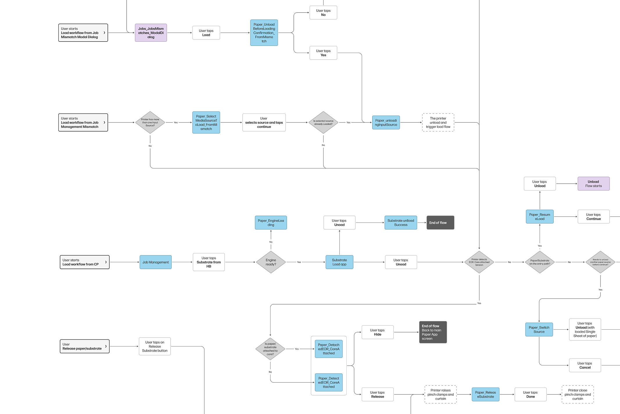
The next phase involved a thorough analysis of the existing UI, where I dissected the interface into its distinct elements which helped me gain a clearer understanding of how each part functions within the overall system. This process revealed several weak spots, such as redundant interactions, inconsistent visual elements, hard-to-reach features, and misaligned layouts.
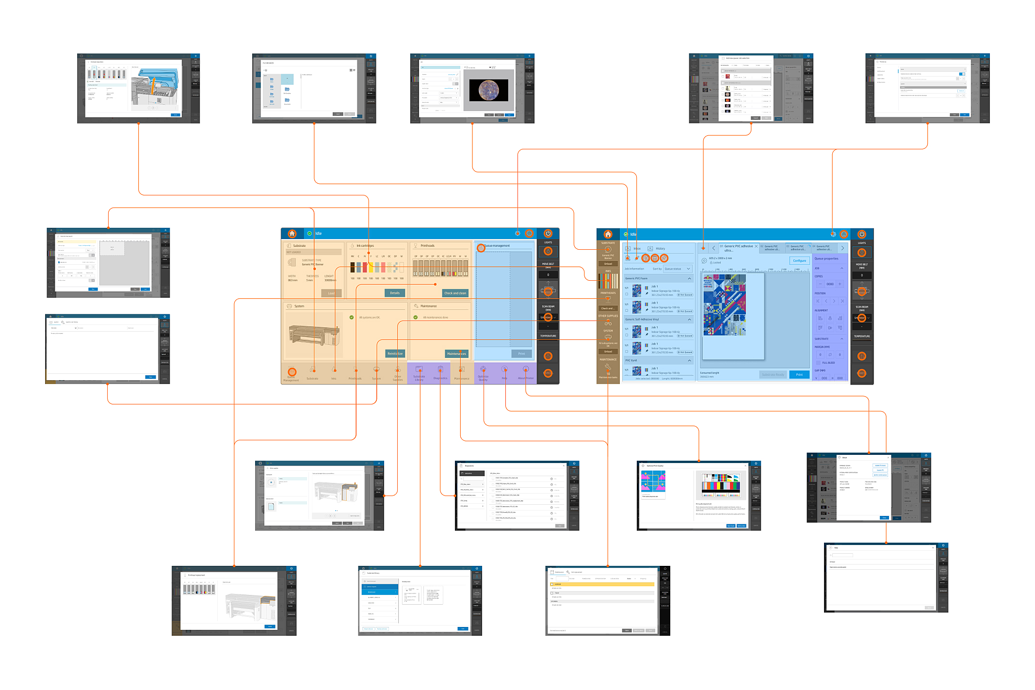
I analyzed the existing user interaction flows to understand how users navigate the system and complete tasks. By mapping out the steps users take to perform common actions I identified areas of friction, revealing opportunities to simplify paths and eliminate redundancies.
Inspiration from other products
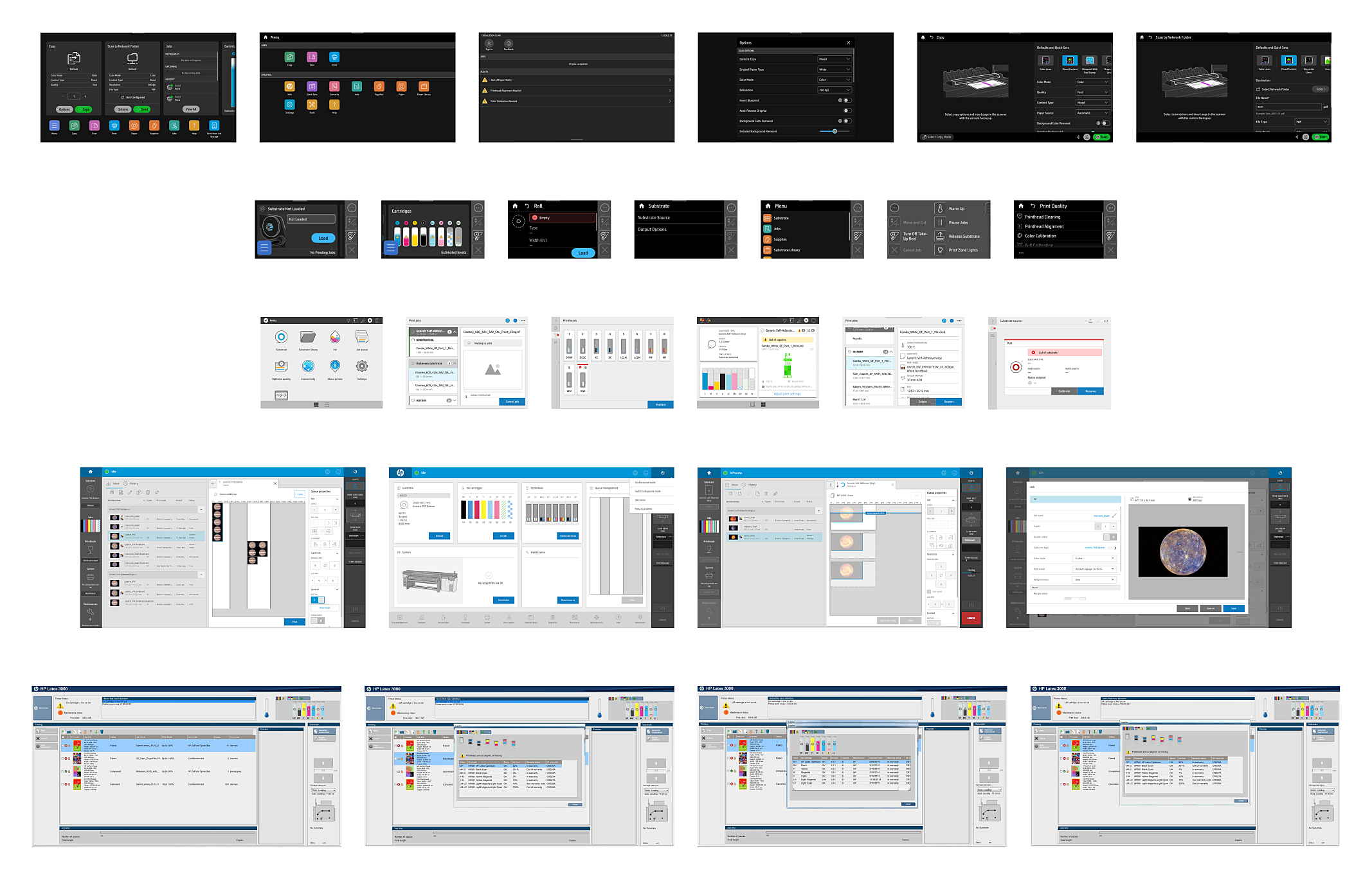
Having understood the status of the current UI, I decided to explore implementations in other products. By examining the past, I got inspiration from navigation structures, interaction flows, and visual elements. Valuable insights into different approaches to user-centric design, workflows, and visual coherence.
Exploration
Sketching the solution
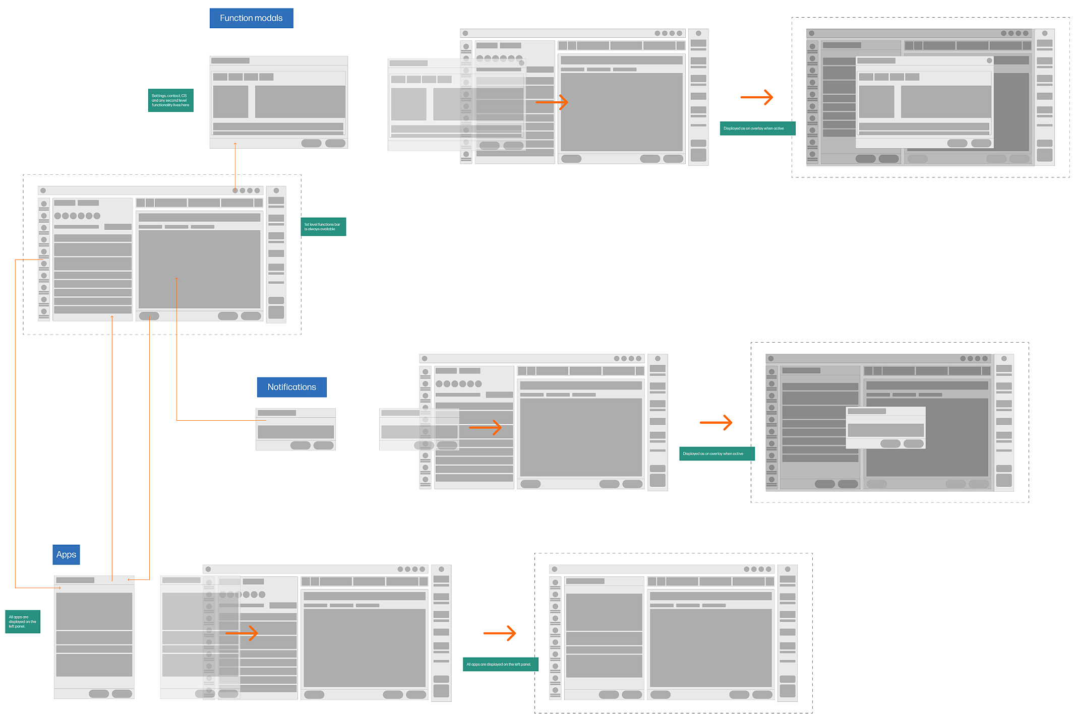
With the key challenges identified I explored and tested the potential solutions with ideas for refining navigation, simplifying interaction flows, and improving the overall layout. The focus was on creating a more intuitive structure by reducing the number of steps required to perform tasks, consolidating redundant features, and improving the organization of key functions.
An improved visual design
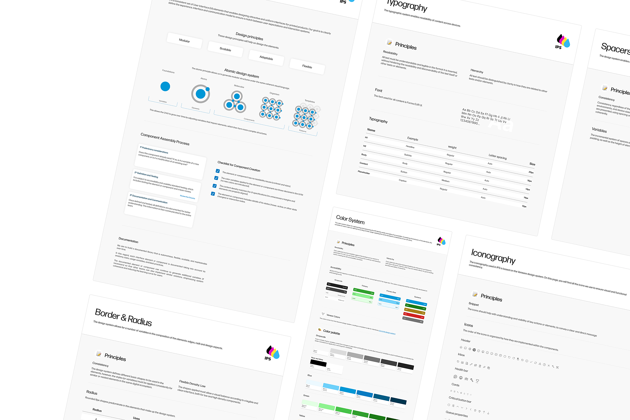
The current printer control panel UI was visually disconnected from the broader product line’s design system. To fix this, we developed a new UI kit aligned with the design standards used across the rest of the product line. It included consistent typography, color schemes, button styles, iconography, and layout grids that ensured visual harmony and also reinforced brand consistency.
Solution
A design for continuity through an improved user interface
The proposed solution balances introducing new features and preserving the core logic of the previous UI. The objective is that current users can easily adapt to the updated interface without feeling disoriented, maintaining a sense of familiarity while benefiting from enhanced usability.
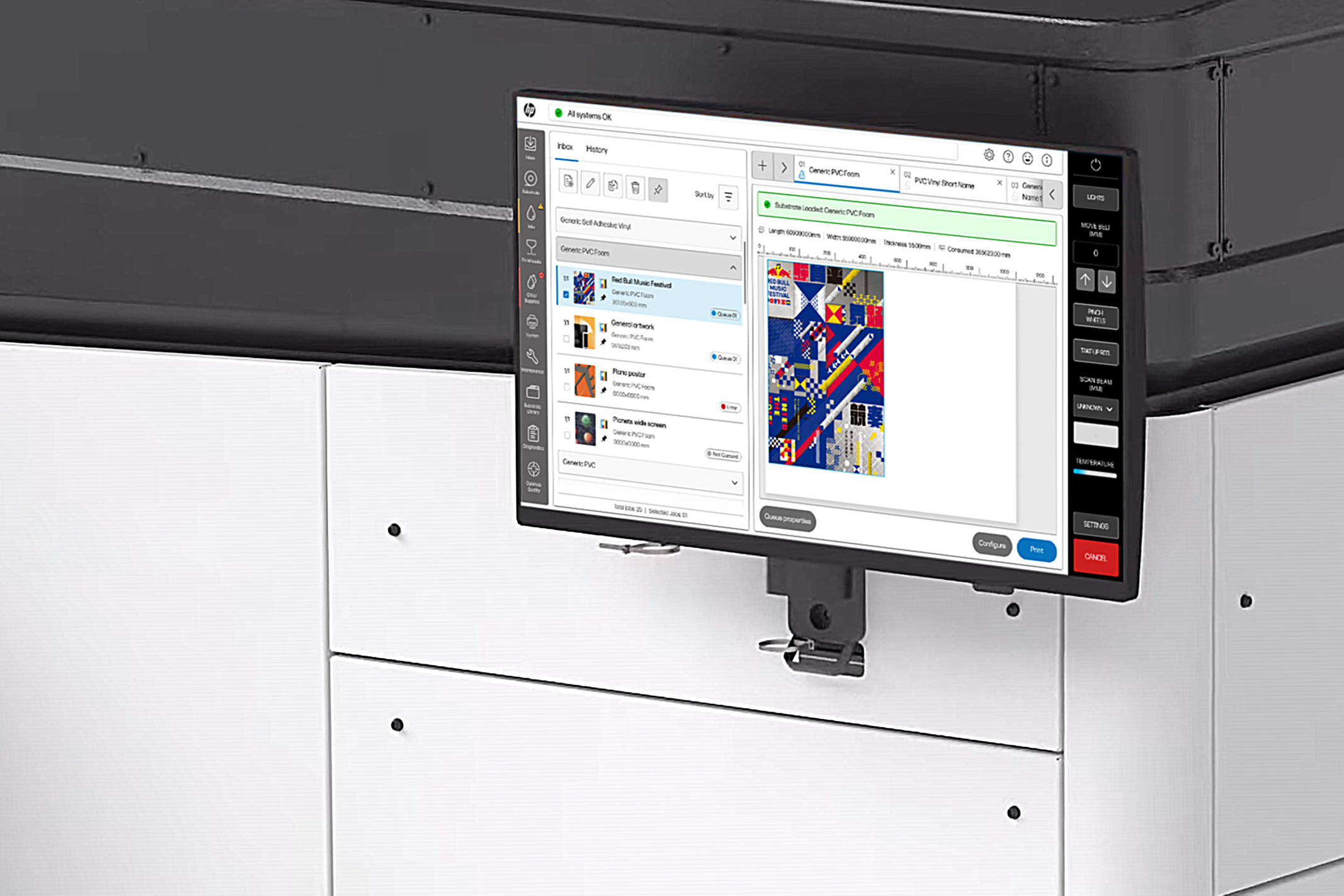
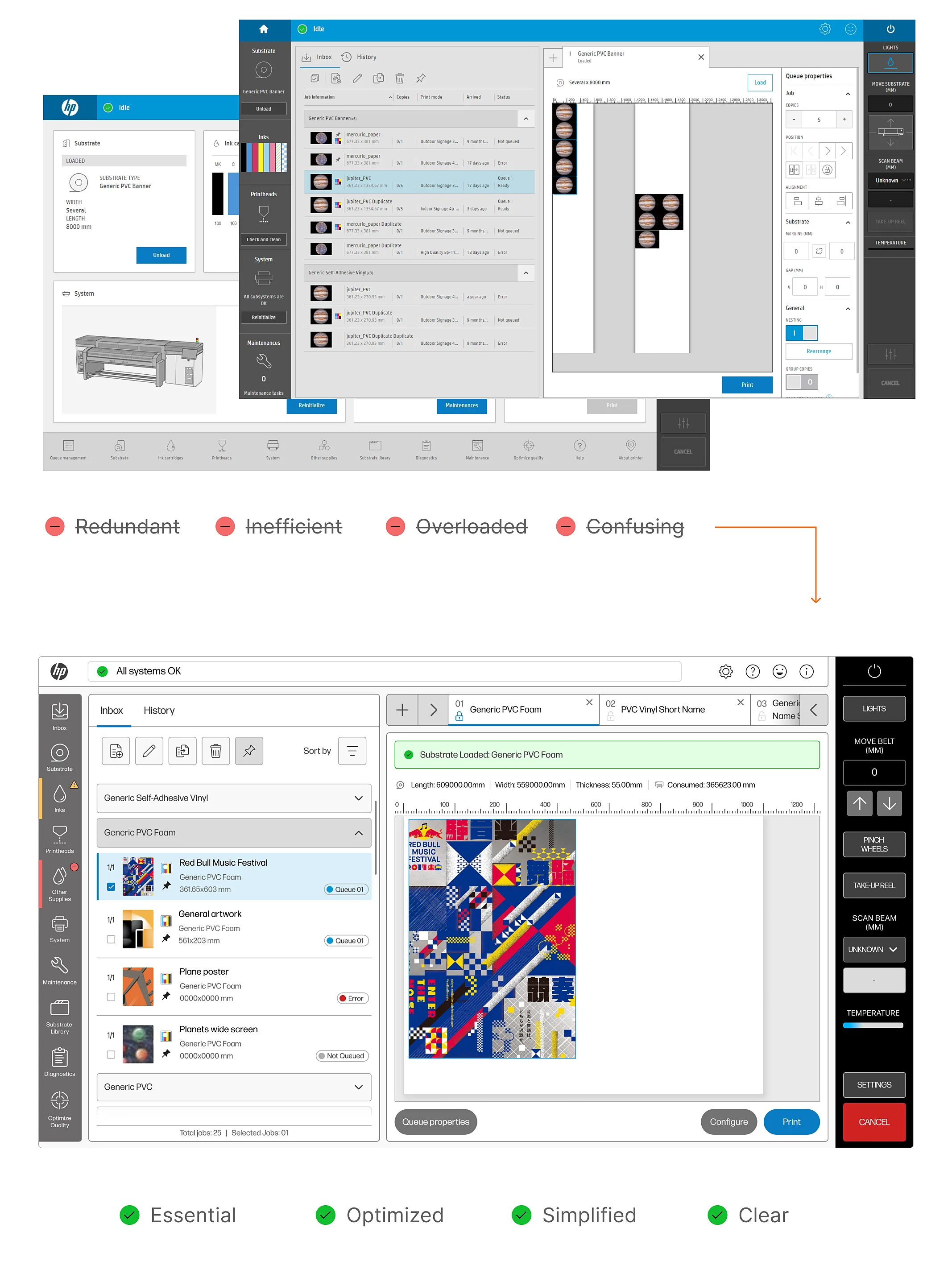
A design that simplies the interaction and reduce the amount of screens and optimize the space usage, prioritizing what’s important to the user. Less screens + less steps to perform a task = A fluid experience.
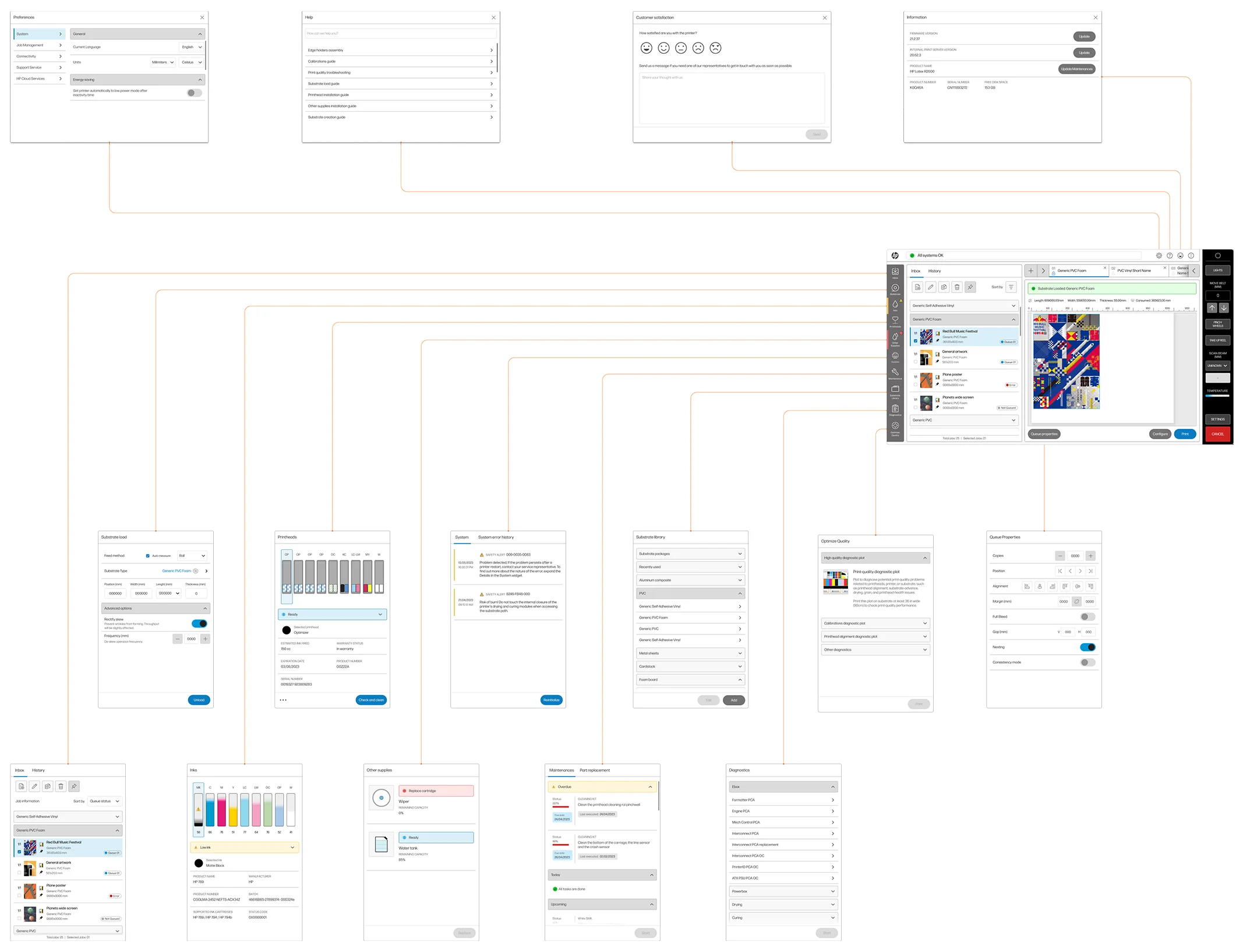
The redesign of the UI focused on addressing key pain points while maintaining a familiar experience for existing users.
Key improvements include:
- Dashboard unification by reducing them from 2 to 1, focusing on the main features in a concise, precise layout that enhances usability.
- No full-screen modals in favor of a dedicated, always-visible area to display settings and other printer features, improving accessibility and task efficiency.
- The job management area always visible, a critical feature for users, ensuring quick access to essential job-related information without additional navigation.
- Enhanced status indicators and notifications, by removing redundant or misaligned visual elements to ensure clarity and relevance, helping users respond quickly to important updates.
- Simplifying the information displayed, by prioritizing the most frequently used data to reduce cognitive load, resulting in a cleaner, more focused UI.
- An updated visual experience that aligns with current design standards and meets accessibility requirements, improving the aesthetic appeal and functionality.
